Design is more than just finding the best way to convince someone to buy something or make a product appealing. The ability to distinguish oneself from one’s competitors is more important than ever in the age of click and add to cart. But if a story behind a product is compelling, that can be the difference between someone glancing, and someone purchasing. Telling a story via design choices can make that difference manifest.
Introduction to Storytelling
The Cambridge dictionary describes storytelling as, “The activity of writing, telling, or reading stories.” So, how does this apply to design? Design can use storytelling as a tool to build empathy and create a mood. The designer needs to be able to tell a story with visual cues like shapes, colors, and lines. A design that utilizes storytelling helps create the story. In an episode of the tv show “Modern Family,” one of the characters has a hard time selling gift wrap for a school project, until his stepdad comes in and says, “You are not selling gift wrap, you’re selling Christmas. The excitement of opening presents. The taste of eggnog.”
A design, in order to effectively tell a story, needs to create a world, generate a need, and introduce the solution/product. The storytelling goal is to create empathy in the consumer. It goes beyond picking pretty colors and shapes. Design helps support and elevate the story as well as the experience.
Highlighting Emotions
As a designer, you have to pay attention to what emotions you want to inspire. Certain colors, shapes, and products have different meanings and interpretations, based on the environment and cultural setting in which they’re used.
The design should match the emotional need. For example, if I produce medical treatments, my design should be reassuring, calming, and instill confidence in the treatments themselves. That is why green and light blue are so common in medical related designs; those are calming and relaxing colors.
Use Color Wisely
The choice of color can dramatically change the look and feel of a product, consequently changing the user’s perception of it. In film, a city with bright neon colors in contrast with a dark and wet environment instantaneously sets the mood for a futuristic city. On the other hand, a cheerful pastel color palette suggests a suburban town.


Colors in web design
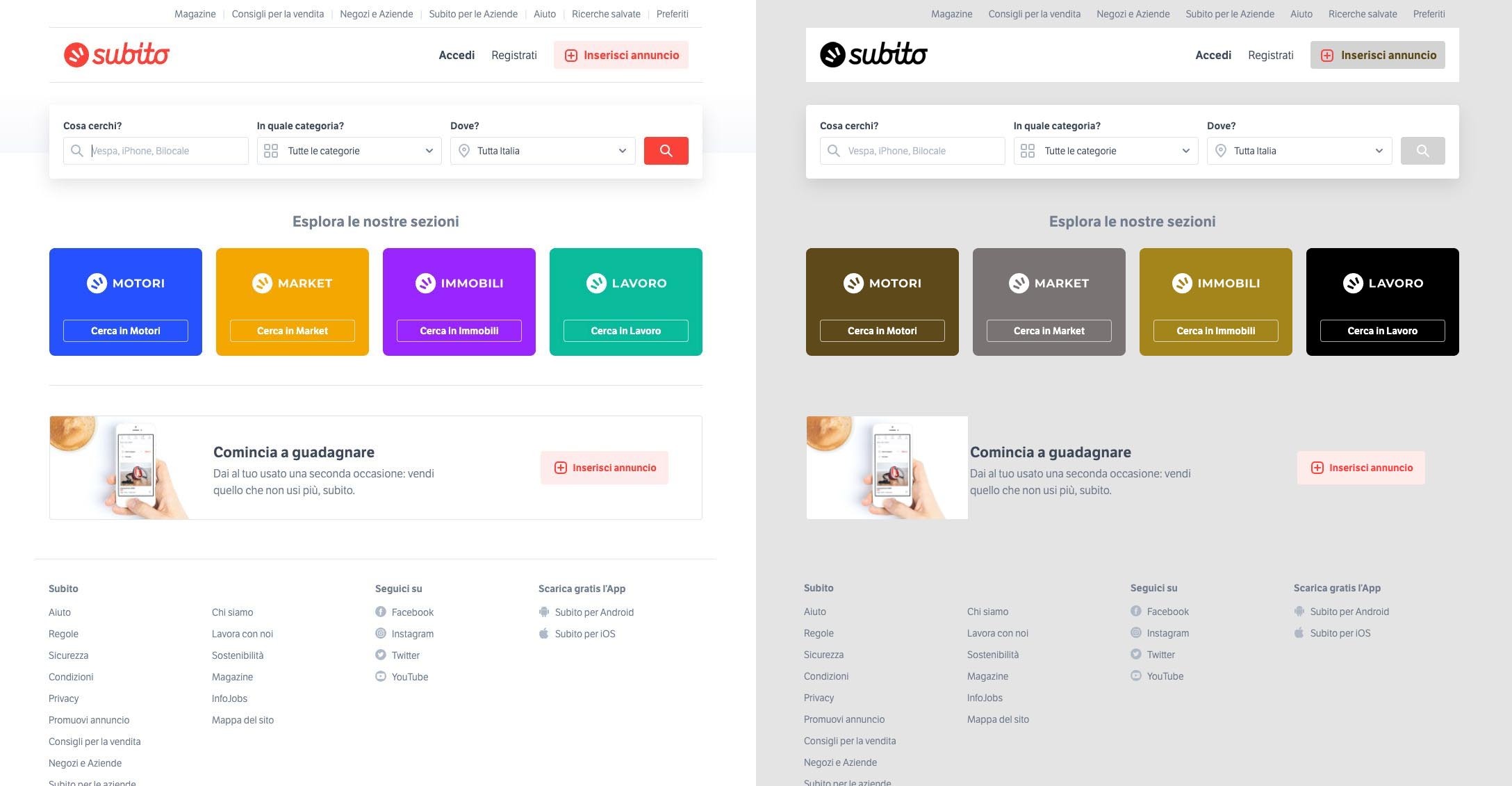
Subito.it is a marketplace for used/secondhand merchandise. The original design has bright, cheerful colors. Brilliant colors are common in e-commerce websites, as they are attention grabbing. By changing the colors, notice how the interface changes and becomes passive and dull. The vibrant color of the original design leads the user to spend more time on the website, thus encouraging purchasing.
Using Colors to Set a Mood
The use of colors can change the whole look and feel of a scene. One of the best examples of color usage is “The Wizard of Oz.” The sepia tones of the Kansas plains in the Great Depression are a complete contrast to the almost overwhelming burst of color when Dorothy opens the door to find herself in Oz. There is no black, white, or grey anywhere. There’s no Dust Bowl, no worries about whether the farm is going to fail. Years later, my breath still catches when Dorothy opens the farmhouse door to find herself in the land of Oz.
One Product, Two Stories
Colgate focuses on the health benefits of using their products. They’re selling trademarked products that work. There are three trademarks in the heading of Colgate’s advertisement, immediately catching the viewer’s attention. You know they’re reputable. Even the choice of toothbrush color tells a story. Blue is an extremely common color in medical logos. It promotes trust, calm, and credibility. Sure, lime green is a bolder choice, but blue makes more sense in this case. Even the background is a stark white, again reinforcing a sterile, clean, and safe environment. The primary focus of Colgate’s design here is how well this toothbrush cleans, while improving and maintaining tooth and gum health.
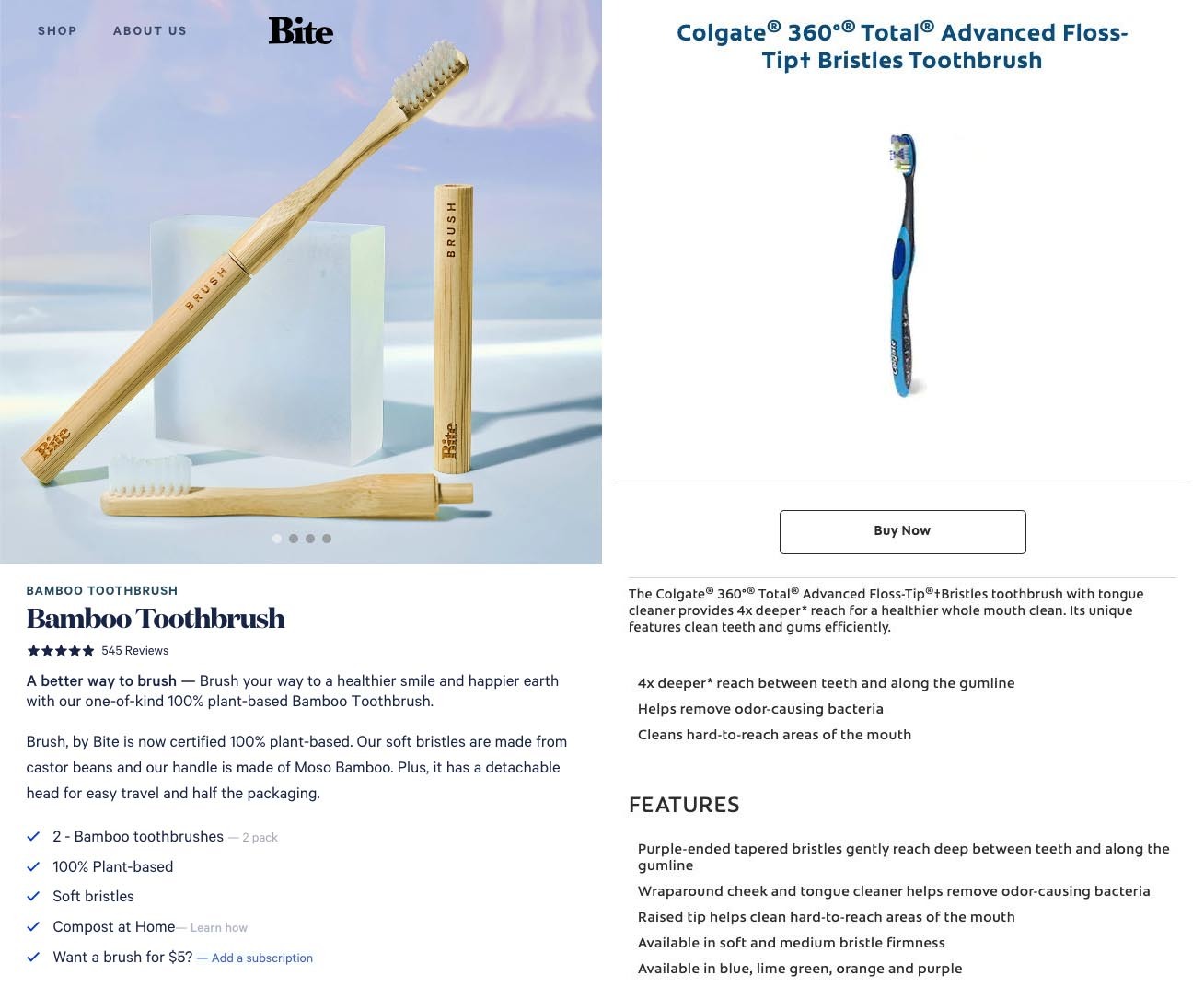
Bite, on the other hand, has a very different story. The focus is on the product being more sustainable than the leading brands. 100% plant-based, compostable, less packaging, and pointing out (three times), that their handles are made from bamboo has nothing to do with dental health. Bite doesn’t mention any of the health benefits of using their toothbrushes beyond, “Brush your way to a healthier smile.” Their product is less about your health, and more about sustainability, and the planet’s health. Their product mirrors this in its appearance imagery. The natural texture of bamboo is visible. The color of the bristles are a natural hue. It’s not about your teeth, it’s about the planet.
The product these companies sell is the same, a toothbrush. Yet they’re each telling a completely different story. The strategies used are different. Bite’s selling point is its sustainable and environmentally friendly core. It leads someone to feel confident about choosing an eco-friendly product, and happy about making a conscious choice. Colgate, a leading brand, sells professionalism and reliability with design listing expert information, and clean, clinical colors. Even the CTA (call-to-action), is clear, encouraging someone to BUY NOW.
Conclusion
Businesses have the opportunity to reach a wide audience with their design choices. By incorporating storytelling tactics into their design, they’ll be able to be heard above the noise and create and engaging, iconic design.
