Design is something you don’t quite notice if it’s well done. Bad design, though, hits you over the head with a 2×4. Your web design choices also influence what decisions a customer makes on your website, which could turn a simple browsing session into a business transaction. We’ll focus on a few points in this article, and follow up in greater detail in later articles. For now, let’s focus on some of the basics.
Images and Video
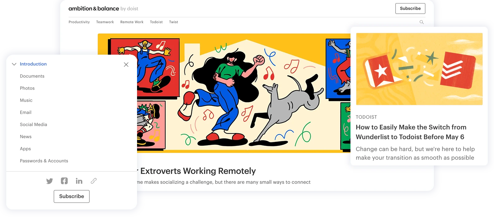
A website with clear, crisp, high resolution images pertaining to your business fare much better than a website with generic stock images, or a website with no images at all.
Your website doesn’t have to be full of images. An absolute bombardment of color, graphics, photos, and video can lead to sensory overload, and increase the number of people who very quickly leave your site. Your design should make sense for what you want to portray for your brand/business/influencer empire. Are you selling custom furniture made from salvaged wood found on the beach? Maybe only use colors you would find at a secluded beach.
Think of how a grocery store is laid out. The first thing you see is produce or flowers. It’s bright, fresh, and pretty. That’s done on purpose, because it makes you comfortable. If you’re going shopping and the first thing you see are utilitarian rows of cans, you’re not going to want to wander. You’ll get your stuff and get on out. But if you’re made to feel welcome, then you’ll meander, trying samples and then going through your grocery bags two hours later, holding something in your hands and wondering how on earth THAT got into your cart.
Don’t be a Maze
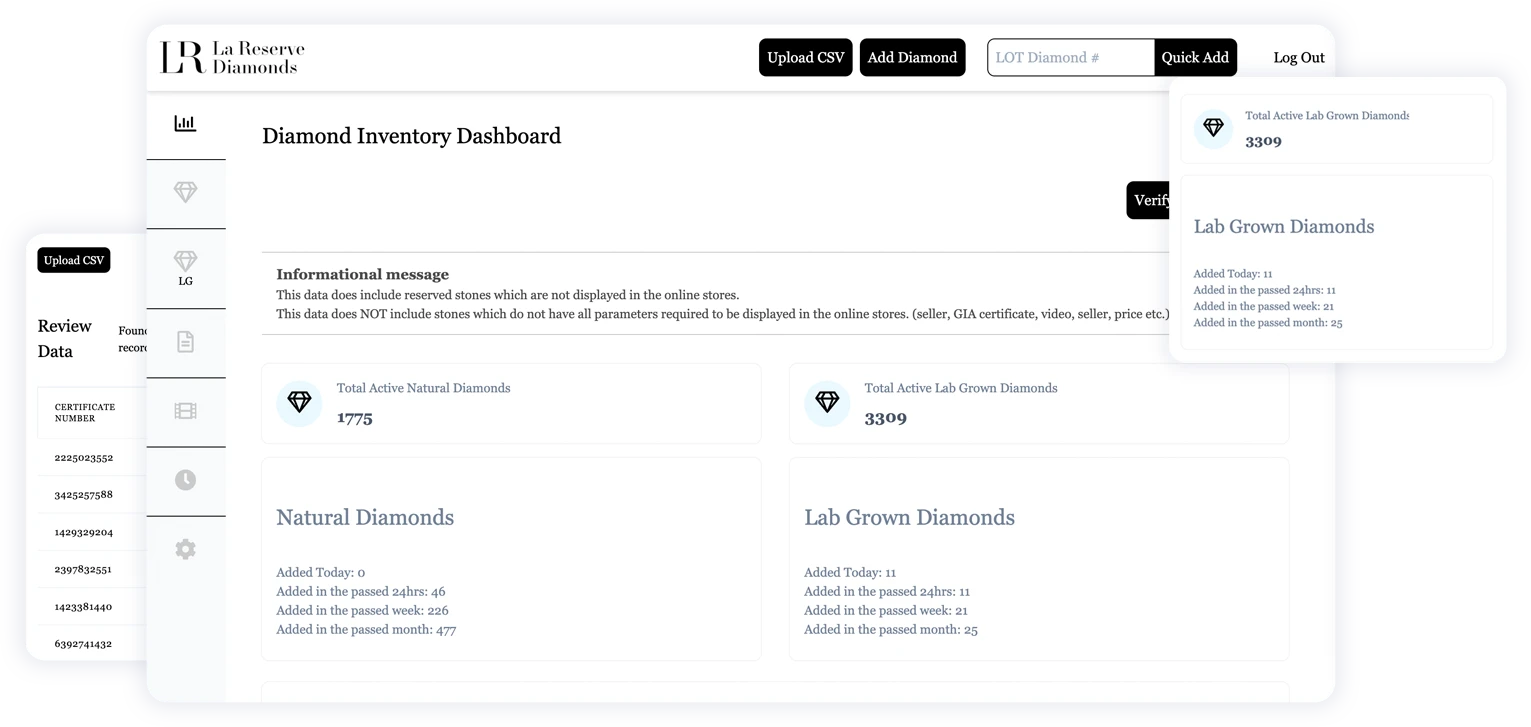
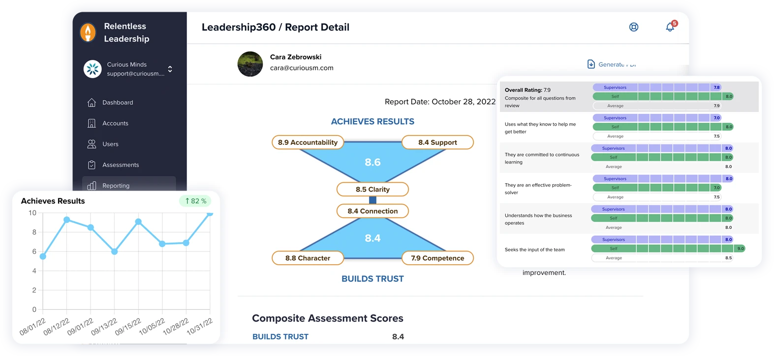
Designing a sustainable website to be easily navigable, whether it be a computer or a mobile device, makes any purchase more enticing. If it’s a difficult process just to find what you’re looking for, it’s not worth the time. Online shopping is meant to be easy and remove complications, not add them. This is not a corn maze, leading us to a potentially dubious end. The easier it is to add something to your cart and pay for it, the more you’ll buy, and come back to buy even more.
Clean Up Your Copy
A well designed website looks like you know what you’re doing. Consistent font and margin usage are easy ways to look competent. Don’t change your concept from one page to the next, even if you want to mix it up. There are better ways to mix it up while showcasing your skill and expertise. You can include a video explaining a product on one page, for example, and then showcase client testimonials on another.
And don’t dismiss the power of spell check. It’s true that many of us are including more and more abbreviations to our everyday written exchanges (lol, anyone?). But when you’re showing the best of yourself, and what you have to offer, the written version of sweatpants just isn’t enough.
Speed and Responsiveness
Is your site viewable on a computer, as well as a mobile phone? If so, you’re doing it right! A website that works well on all devices will be viewed by more people. More people than ever are viewing websites from a mobile device. How often do you need to show someone something on your phone, or need to find the nearest gas station? It’s a huge opportunity.
A responsive web site is also simpler to maintain, and more budget friendly. It’s impossible to create a version of your website for each possible screen scenario. How many different monitor sizes are there, laptops, tablets, or phones? And how often are there new releases, or improved versions? There’s no way to keep up without going insane and broke.
Speed is also hugely important. Bigger, faster, better, right? The faster your pages load, the faster someone can start shopping, or contacting you for a meeting. A faster site also improves your SEO, making your site easier to find. If you have images or video, they need to be viewable immediately. You can use lazy loading images (images that only load when you scroll), if you’re concerned about a decrease in speed. Or, you could even forgo videos and images, when appropriate.
Neither one are more important than the other, but neglecting either can cause serious issues with your site.
Influencing Decisions
Ultimately, maintaining the basics on your website greatly influences consumer decisions. Think of each of the points we’ve made as a section in an orchestra. The orchestra can still perform, but you’ll notice if, for example, the entire string section were missing. The same is true of your website. You don’t quite realize how important each piece is until there’s a problem. Curious Minds’ maintenance plans ensure that never happens. Our plans are designed to optimize and maintain your website, so you can take your business to the next level.
